Key Takeaways
- iOS 18 has several bugs, damaging the seamless Apple experience.
- Some UI features of iOS 18 are not well-thought-out, ruining user experience.
- The best features of iOS 18, including Apple Intelligence, are delayed.
The arrival of a new version of iOS is always exciting, with the promise of new features that will make your current iPhone feel like a totally new one. There’s been even more hype about iOS 18 than usual, due to the inclusion of Apple’s first AI features, called Apple Intelligence.
Now that iOS 18 is here, however, I can’t help feeling more than a little underwhelmed. There’s a lot to like in iOS 18, with far more customization than we’ve been allowed in the past, and it will only get better from this point on. However, even for a first official release, I can’t help feeling that iOS 18 just feels underbaked. Here’s why.
iOS 18 is currently full of bugs
Apple’s efforts not to repeat mistakes of the past appear to have failed
Apple prides itself on user-friendly design that makes using products such as the iPhone intuitive, even for users who are less tech-literate. Apple apps and devices are supposed to “just work” with a smooth user experience, meaning you never think about the magic that’s going on behind the curtain.
iOS 18 in its current form does not give that experience. There are bugs galore in iOS 18 that feel very un-Apple. One of the most noticeable I’ve found is problems with the Tinted setting for customizing your Home Screen. This allows you to set all of your app icons to a specific color, which overrides the usual colors of the app icons and gives you a unified look for your Home Screen. When it works, it looks great, but there are some serious flaws.
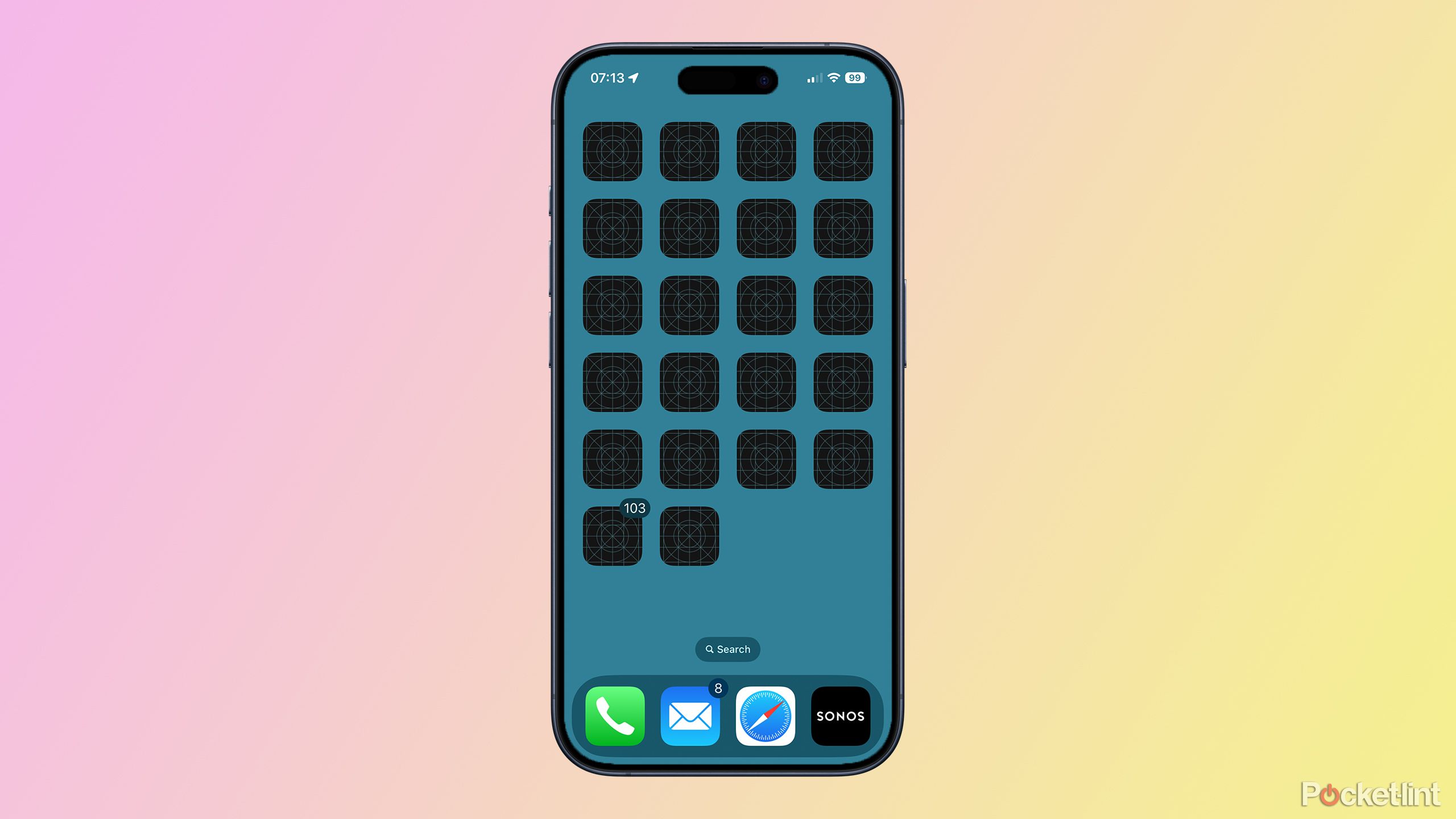
Often, when closing out of apps, I’ll watch the icons change from their usual color to the tinted version right in front of my eyes, sometimes after a pause of several seconds. Sometimes the docked apps at the bottom of the screen are tinted, but the Home Screen apps aren’t. Several times I’ve switched to a new page of apps to see wireframe app icon placeholders instead of the icons themselves.
There are plenty of other bugs that take you out of Apple’s usual seamless experience and make you remember that you’re running software rather than your iPhone just working like magic. I’ve regularly crashed out of the Control Center when trying to customize it, I’ve crashed out of Lock Screen customization when trying to change the Lock Screen buttons, and I’ve had strange messages from other iOS 18 users telling me what reaction they sent me rather than the reaction itself actually appearing.
New releases of software will inevitably have some bugs, but it wasn’t meant to be this way with iOS 18.
New releases of software will inevitably have some bugs, but it wasn’t meant to be this way with iOS 18. As reported by Bloomberg’s Mark Gurman last November, Apple actually stopped working on developing new iOS 18 features for an entire week to focus on fixing the large number of bugs that were found in the code. The move was intended to stop there being a repeat of the problems with the launch of iOS 17 which contained numerous bugs, including issues that were causing iPhone 15 devices to overheat. Unfortunately, iOS is far from the perfect release that Apple was hoping for.
Some iOS 18 concepts haven’t been fully thought through
Your beautiful Home Screen aesthetic is all too easily ruined
Even when everything works as expected in iOS 18, there are some features that clearly haven’t been completely thought through. One such example is the Tinted app icons feature.
The whole purpose of this feature is to take your Home Screen, which is usually a mess of different colored app icons and widgets, and turn it into one beautiful, harmonious screen where everything is the same color. People have been using widgets to create ‘ Home Screeen aesthetics‘ for as long as it’s been possible, and this feature is supposed to make it easy to do in just a few taps.
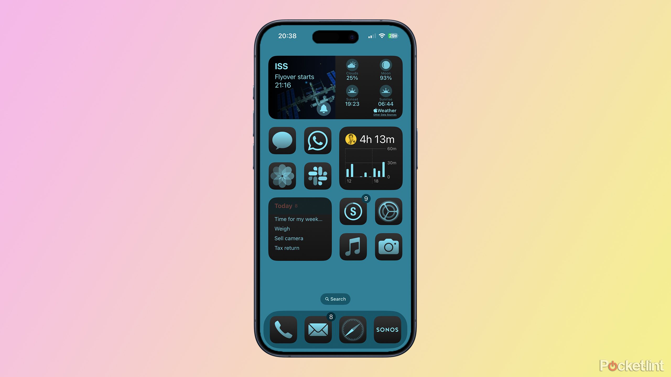
All the app icons are the same light blue color on a dark gray background, which would look beautiful if it wasn’t for one glaring lump of bright yellow in the middle of my screen.
Using the Tinted feature, my Home Screen almost looks perfect. All the app icons are the same light blue color on a dark gray background, which would look beautiful if it wasn’t for one glaring lump of bright yellow in the middle of my screen. This is my Screen Time widget, in which the bars on the chart have been tinted light blue, to perfectly match the rest of the app icons. Unfortunately, my Apple Account icon, which is also displayed in the widget, isn’t tinted at all, and beams out in all its bright yellow glory. It totally ruins the otherwise harmonious aesthetic. I could understand if this was a third-party widget, but this is one of Apple’s own.
There are other examples, too. When you’re choosing a background color for your Home Screen, a color picker and slider appear to allow you to edit the color. However, this UI element dims the screen behind it, meaning that the color it displays is not the actual color that you’re selecting. You only get to see the final color when you close the color picker, and not while you’re actually selecting it. It’s a small detail, but these are the kinds of things that Apple usually gets right rather than wrong.
iOS 18 has some horrible UI decisions
Photos is a mess and Control Center has its priorities all wrong
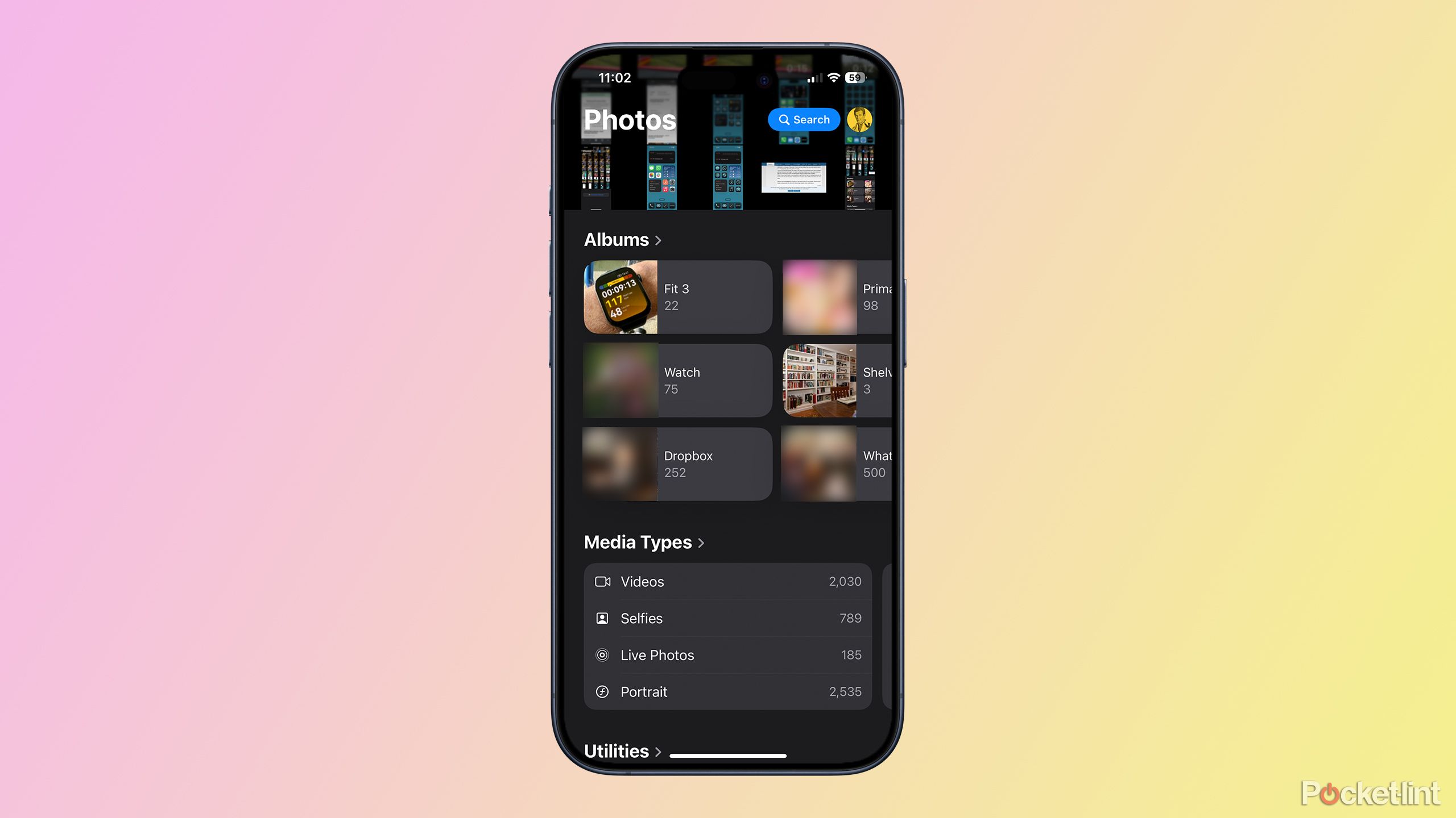
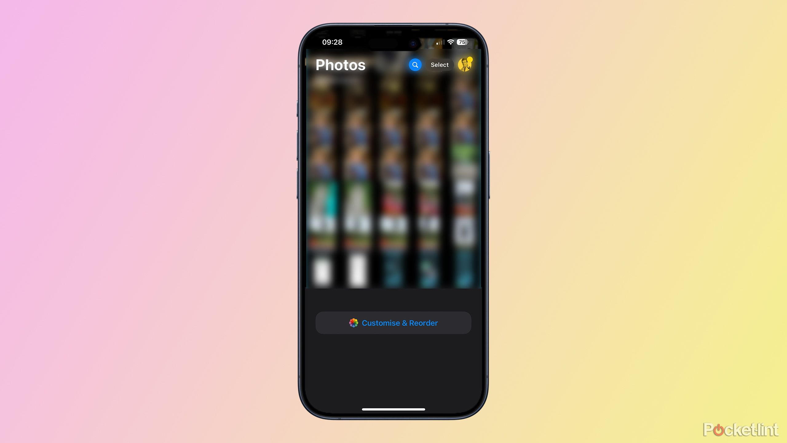
Some of the decision-making in iOS 18 is also questionable at best. Apple has completely torn up the Photos app and started again, but the new Photos apps is all sorts of wrong. The simple and effective tabs that used to let you select different sections of the Photos app to look at are gone, and now everything is dumped on one single screen. You get some of the screen devoted to your camera roll but large parts of it devoted to other things such as Recent Days, People, and Pinned Collections. You know, all the stuff you never ever use or look at.
It is possible to customize the page and get rid of everything except the camera roll, but even if you do this, instead of seeing a full screen view of all of your photos, the app opens with half of the screen empty except for the Customize & Reorder button. If, like most people, you just want to open the Photos app and, you know, see all your photos, you’re bang out of luck.
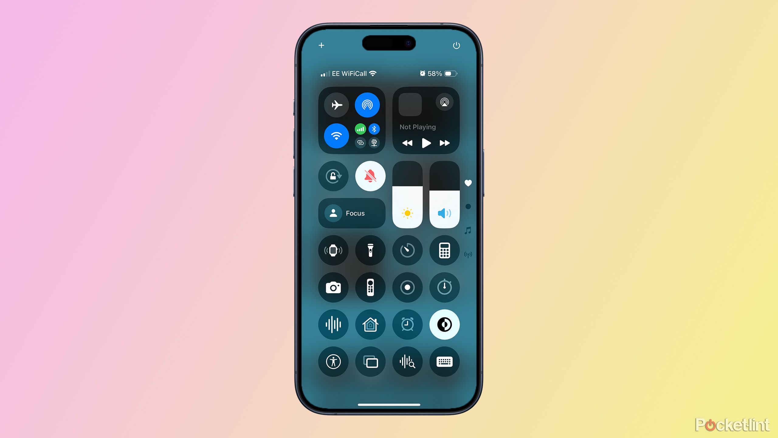
Another swamp of poor decisions is the Control Center. The updates to Control Center are genuinely useful, allowing you to customize your Control Center options to make it far more useful. However, there’s one area where the Control Center has got worse, not better.
In iOS 17, if you wanted to turn off Bluetooth, you could swipe down to open Control Center and tap the Bluetooth icon. Two gestures, done. In iOS 18, the Bluetooth control is visible at the top of the screen, but it’s stuffed in a folder with some other controls, so you either need to tap that folder, or do a long drag to get all the way down to the very last Control Center screen. And then, finally, you can tap the icon to turn Bluetooth off. What was two taps is now a tap or drag more.
Here’s the real kicker. Where the Bluetooth button really should be, Apple has decided to put the AirDrop control instead. Because that’s the one people want to use most, right? You can add a dedicated Bluetooth control to Control Center if you wish, although you shouldn’t really have to in the first place. What you can’t do is add a dedicated Wi-Fi control that will turn off Wi-Fi completely and not just until tomorrow, although some clever souls have figured out how to do it using Shortcuts.
All the best features are missing from iOS 18
Apple Intelligence is coming but even then, only in bits and pieces
Apple/Pocket-lint
Apple’s newsroom published an article yesterday about the release of iOS 18, listing some of the features. It only got as far as the fourth feature before it had to resort to talking about something that will be “available later this year.” That’s right, after talking about customization, the new Photos app, and Messages changes, the next feature listed is intelligent categorization in Mail, something that literally does not exist in iOS 18 right now. And after a couple more features, inevitably, the article turned to the exciting new Apple Intelligence features, the first of which will be arriving next month.
Apple Intelligence is Apple’s big leap into the world of AI, where it has some serious catching up to do with the competition. And none of it is available right now. Not one feature.
Apple Intelligence is Apple’s big leap into the world of AI, where it has some serious catching up to do with the competition. And none of it is available right now. Not one feature. The first features coming next month are the least impressive, too, with image generation features not due until December, and the big Siri upgrades probably not arriving until 2025. As it stands, it feels like we have less than half of the iOS 18 we were promised.
iOS 18 has a lot of potential, but we might not see it all for a long time
By the time we get the full package, iOS 19 will almost be here
There’s plenty wrong with iOS 18, but it’s important to remember that this is the initial release. Fixes will be made, bugs will be ironed out, and iOS 18 will start to feel more like an Apple product.
There’s plenty to like about iOS 18 too. It may not be ground-breaking, but Apple is finally letting us put icons where we want them, and the updated Control Center has the potential to make using your iPhone quicker and easier, especially as more third-party controls are added.
The trouble is, we were promised so much more with iOS 18, and although additional features are on their way, we’re going to have a long wait for many of them. It could genuinely be the case that by the time we have the full features of iOS 18, Apple will be telling us what’s coming in iOS 19.
To cut Apple some slack, adding in AI features for the first time is no small challenge, especially when you’re so far behind the competition, and this has undoubtedly taken a lot of Apple’s focus. Hopefully we won’t have quite the same issues with iOS 19 and might actually get all the features we were promised on day one.
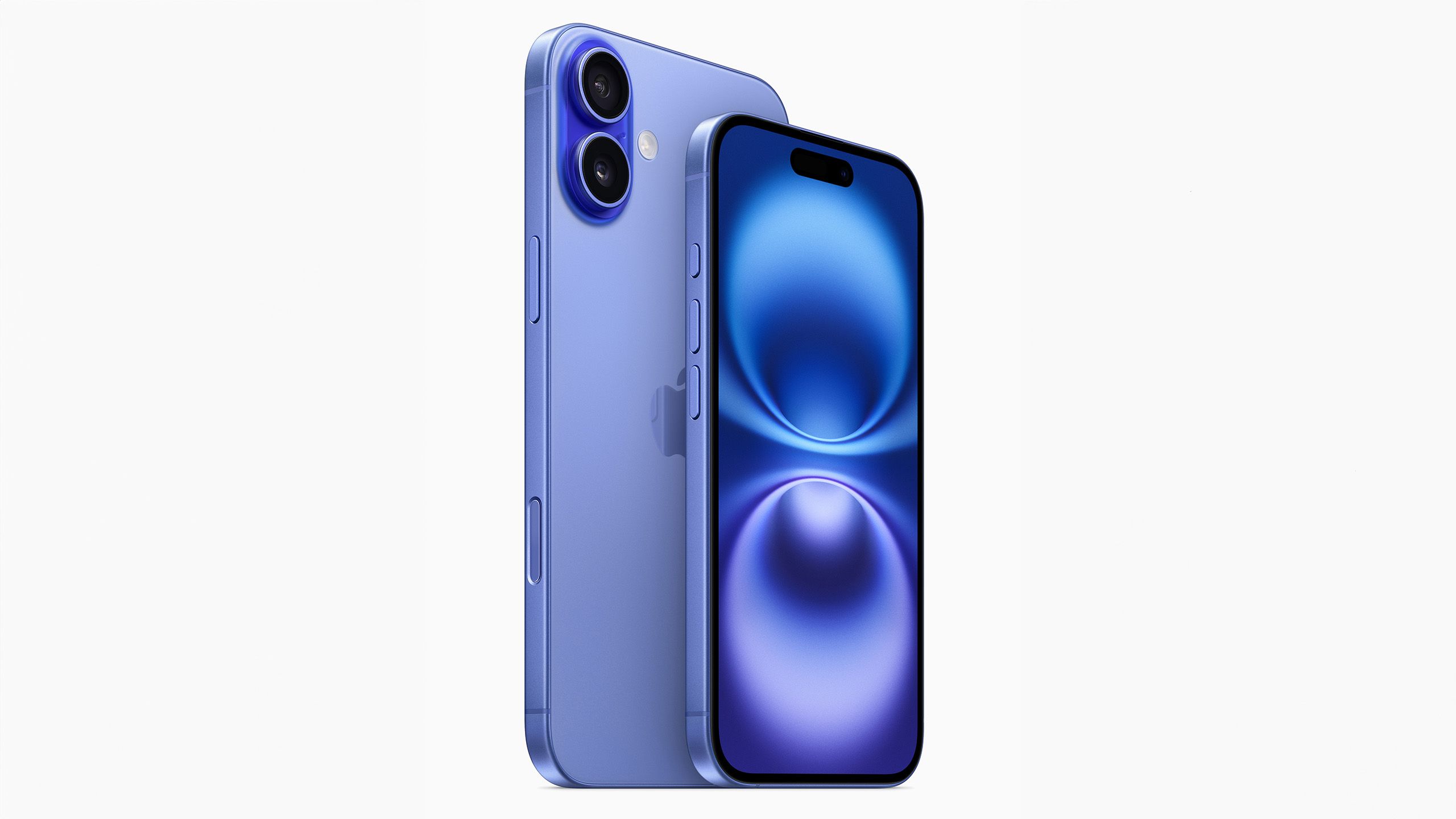
Apple iPhone 16
This year’s iPhone 16 line blurs the line between the “Pro” and the base-level iPhone by offering a new camera button and the Action Button, alongside the A18 chip.
Trending Products

Cooler Master MasterBox Q300L Micro-ATX Tower with Magnetic Design Dust Filter, Transparent Acrylic Side Panel…

ASUS TUF Gaming GT301 ZAKU II Edition ATX mid-Tower Compact case with Tempered Glass Side Panel, Honeycomb Front Panel…

ASUS TUF Gaming GT501 Mid-Tower Computer Case for up to EATX Motherboards with USB 3.0 Front Panel Cases GT501/GRY/WITH…

be quiet! Pure Base 500DX Black, Mid Tower ATX case, ARGB, 3 pre-installed Pure Wings 2, BGW37, tempered glass window

ASUS ROG Strix Helios GX601 White Edition RGB Mid-Tower Computer Case for ATX/EATX Motherboards with tempered glass…
