Key Takeaways
- iOS 18 allows customization of widget sizes for a tailored experience.
- The Weather app widget shows hourly forecasts and is convenient for quick updates.
- Widgets like Reminders and Philips Hue simplify organization and smart home control.
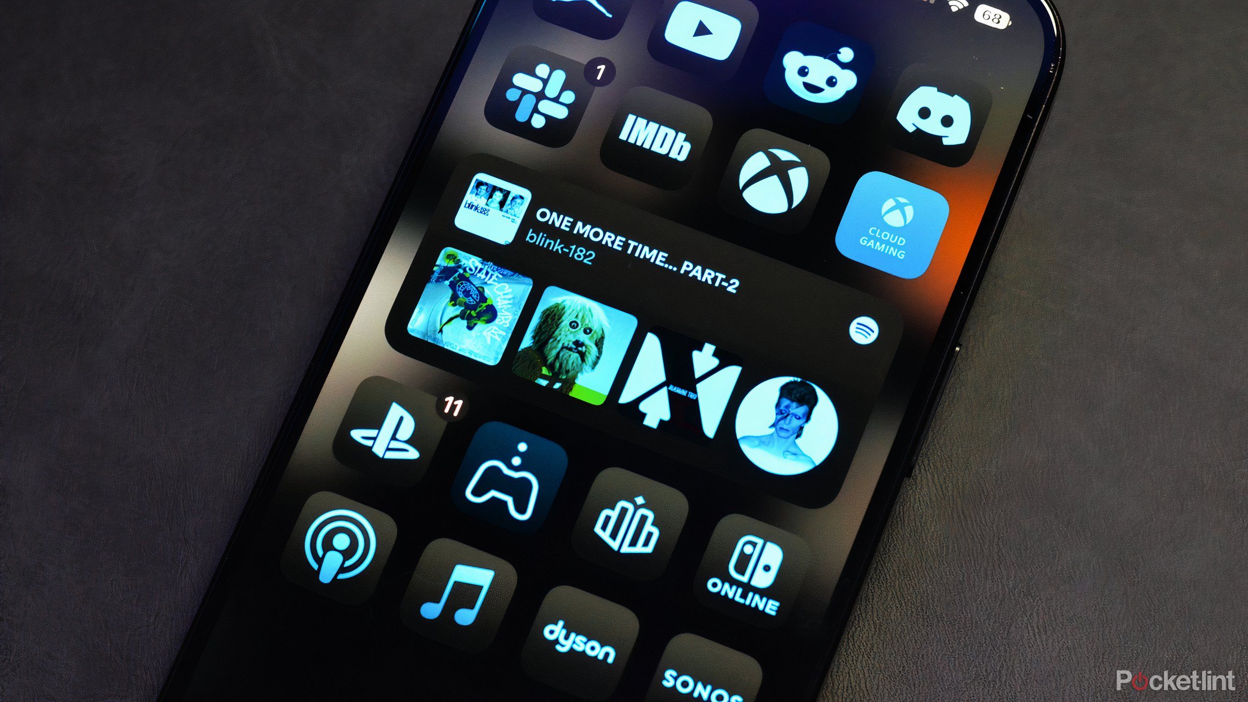
iOS 18 gives iPhone users substantially more agency over the use of widgets. Since the advent of widgets on the iPhone during the iOS 14 heyday, Apple has been attempting to entice users to utilize widgets across core apps and third-party software. With the new operating software, I believe Apple has finally tapped into the true potential it has with widgets.
Like clockwork, Android users will remind iPhone owners that widgets and customization are nothing new. However, for those in the Apple ecosystem, widgets are still fairly fresh and, up until recently, have been pretty half-baked. However, enter iOS 18 to give users a fair number of reasons why they can be useful. They can be customized to take up the right amount of screen real estate, highlight the most important information to you, and be tailored in new and interesting ways.
Here are five reasons why iPhone widgets are useful to users.
iOS 18 now lets you customize the size of most widgets
One of the biggest changes to iOS 18 is the ability to now tailor the size of many widgets to your preference. Rather than be stuck using the same 2×2 widget space for every app, iOS 18 now lets you reshape a lot of supported apps. While you’re still able to use those small boxy widgets that can take up a modest corner of real estate, you can now tap and hold the home screen to see that many apps and widgets offer up to four sizing options.
Apple iPhone 16 Pro
Apple’s iPhone 16 Pro line features a few notable upgrades over last year’s iPhone 15 Pro, including a dedicated camera button, a new A18 Pro chip, a bigger screen, and several AI-powered Apple Intelligence features.
You can pre-select one of the four options ranging from the standard app tile, the modest 2×2 widget size, and all the way to a longer 4×2 widget that’ll take up two rows on your screen. There’s also a massive 4×3. While you pre-select one of the options, you can also initiate the jiggle mode onscreen by conducting a long press on the home screen and then drag the widget to seamlessly customize the sizing. If it’s too large, simply scale it back.
This freestyle kind of customization now makes core apps and many other pieces of software viable as widgets.
2 Get contextual information at a glance from widgets
The Weather app is infinitely more useful as a widget
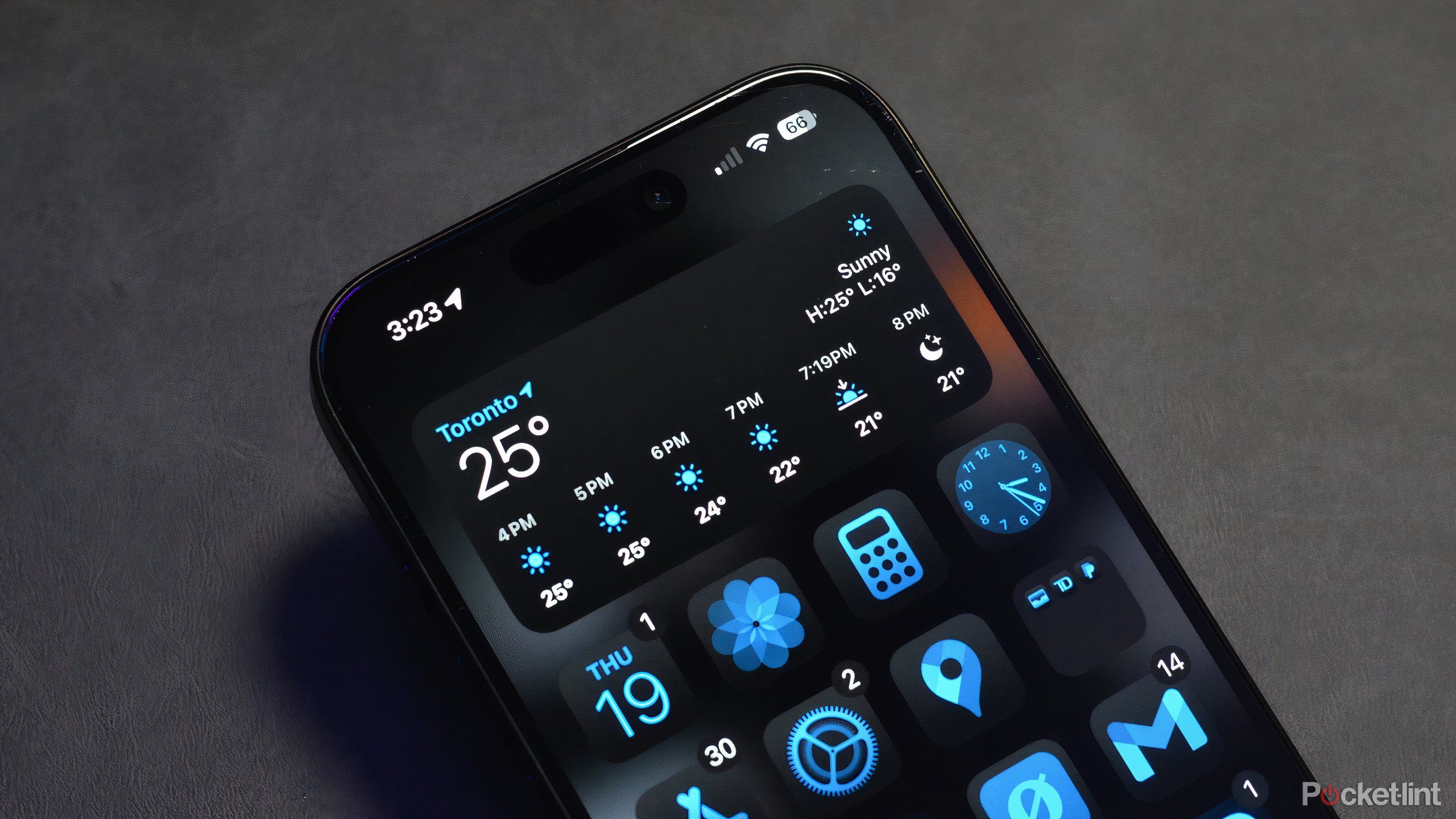
I’m the kind of person who routinely checks the weather report and plans my whole day around it. Without the Weather app widget, it’d take me a whole other step to see any updates to the local forecast. By adding a widget to the home screen, I can see the current weather based on my location. Adding to that, the Weather app widget gives me the forecast high and low for the day as well. Plus, you’ll also immediately note if it’s sunny, cloudy, or raining.
The Weather widget can display six hours of up-to-date weather, including icons per the forecast (rain, overcast, etc.)
What I especially adore about the Weather app widget is the mid-sized 4×2 widget, which offers the hourly forecast. The Weather widget can display six hours of up-to-date weather, including icons per the forecast (rain, overcast, etc.) In Ontario, the weather can flip on a dime, so staying up to date on the precarious weather changes is essential. Since playing with iOS 18, I’ve grown to love the new widget options.
Don’t forget you have a meeting today — or to order batteries
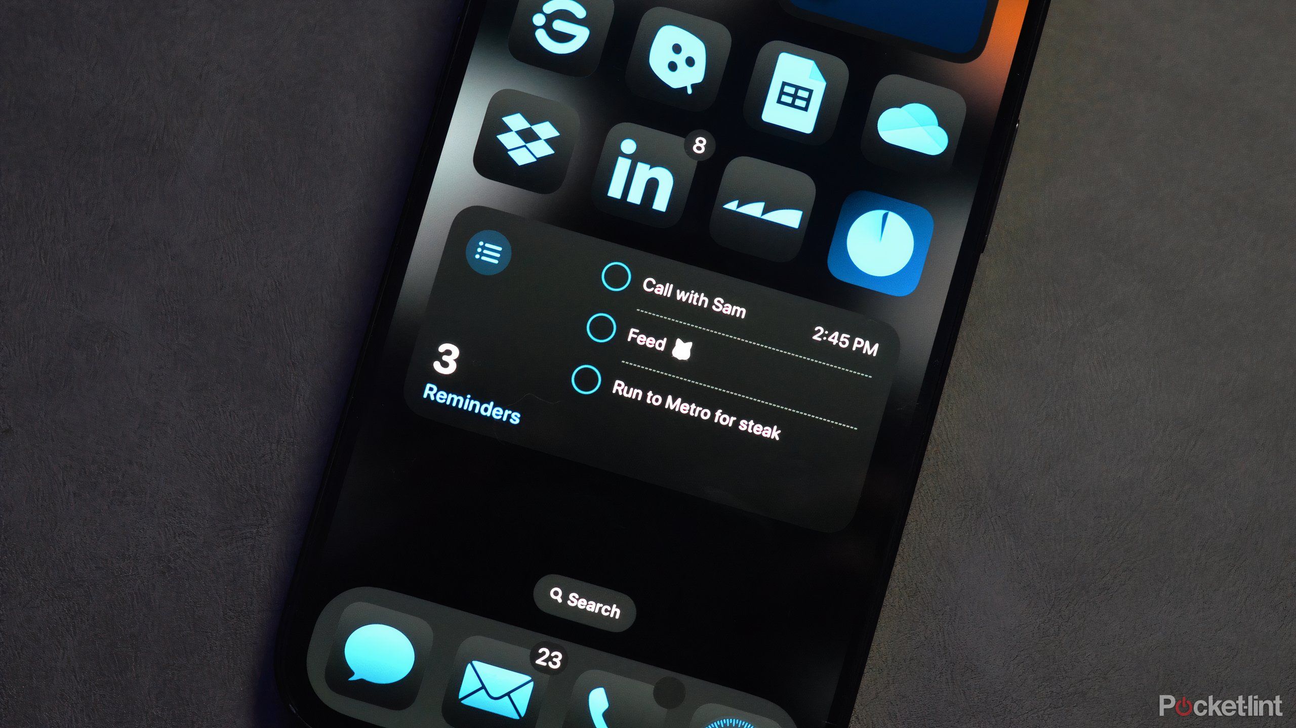
Saying we all live busy lives is an understatement — many of us are spinning countless plates between work, social life, and at-home routines. Like me, you might constantly lean on the Reminders app. Whether it’s to remind myself to order groceries from Costco or to start some chores for the day, the Reminders app is a game changer.
However, the Reminders widget is infinitely more convenient than constantly looking at the app. The widget can display a list of reminders for the day on screen. Whether you’re using the Calendar widget or Reminders, you can see a list of things to get done throughout the day.
Ultimately, how busy your days are will dictate which widget size you’ll choose. Personally, I find that the standard size is plenty to help organize my day.
4 Controlling smart home appliances
Philips Hue makes it very convenient to control your lights using a widget
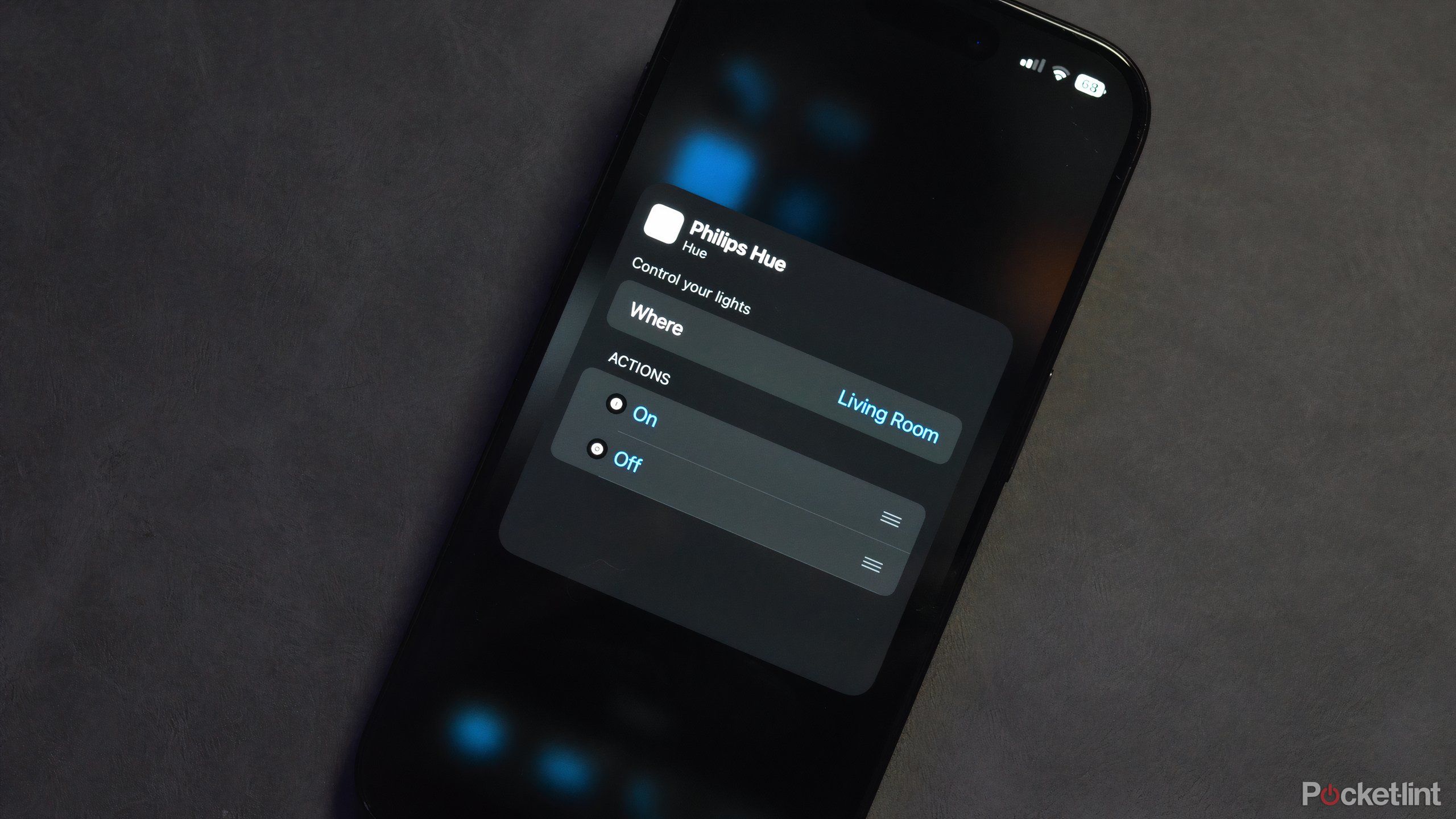
I have a bit of a smart home lighting obsession, primarily with Philips Hue lights. I have lights set up in my living room, office, hallways, etc. A lot of the time I use automation to turn certain lights on, and off, or set the theme. I also have my smart lights tethered through Google Home for automation and voice commands. However, there are times that I don’t want to hassle with voice commands and just want something a little more manual.
With the Philips Hue app widget, you can preset up to eight specific actions for a specific room in your home. For instance, I have my widget set for my living room. With the 2×2 widget, I selected the streamlined option to turn all of my lights on and off at the press of a button. Alternatively, you add preset or created lighting themes so you can automatically adjust your lighting.
Unfortunately, not all smart lighting brands support widgets on iOS — I’m looking at you Nanoleaf.
The Spotify widget still needs work, but it’s getting better
iOS 18 improved the Spotify widget by adding quicker access to in-app selections with larger widget sizes. Previously, the Spotify widget only let you resume listening to your most recent album, podcast, etc. Now, using the larger widget tile, Spotify can display the last five albums or artists. This way, you have more options to click on. As soon as you hit one of the album or artist covers, Spotify loads up, and you’re brought to the album page.
This all being said, I do think that the Spotify widget could use some work. It’s still pretty slow to pull up the artist page after clicking on the widget. I’d also like to see some sort of myopic option to choose a specific song I’ve been listening to recently — Apple Music works in similar ways. I do think both Apple and Spotify can continue to iterate on their independent widgets for audio lovers on iPhone.
Trending Products
Cooler Master MasterBox Q300L Micro-ATX Tower with Magnetic Design Dust Filter, Transparent Acrylic Side Panel…

ASUS TUF Gaming GT301 ZAKU II Edition ATX mid-Tower Compact case with Tempered Glass Side Panel, Honeycomb Front Panel…

ASUS TUF Gaming GT501 Mid-Tower Computer Case for up to EATX Motherboards with USB 3.0 Front Panel Cases GT501/GRY/WITH…
be quiet! Pure Base 500DX Black, Mid Tower ATX case, ARGB, 3 pre-installed Pure Wings 2, BGW37, tempered glass window
ASUS ROG Strix Helios GX601 White Edition RGB Mid-Tower Computer Case for ATX/EATX Motherboards with tempered glass…
